Role
Interaction Designer
Timeline
Sep 2022 - Dec 2022
What is Sential?
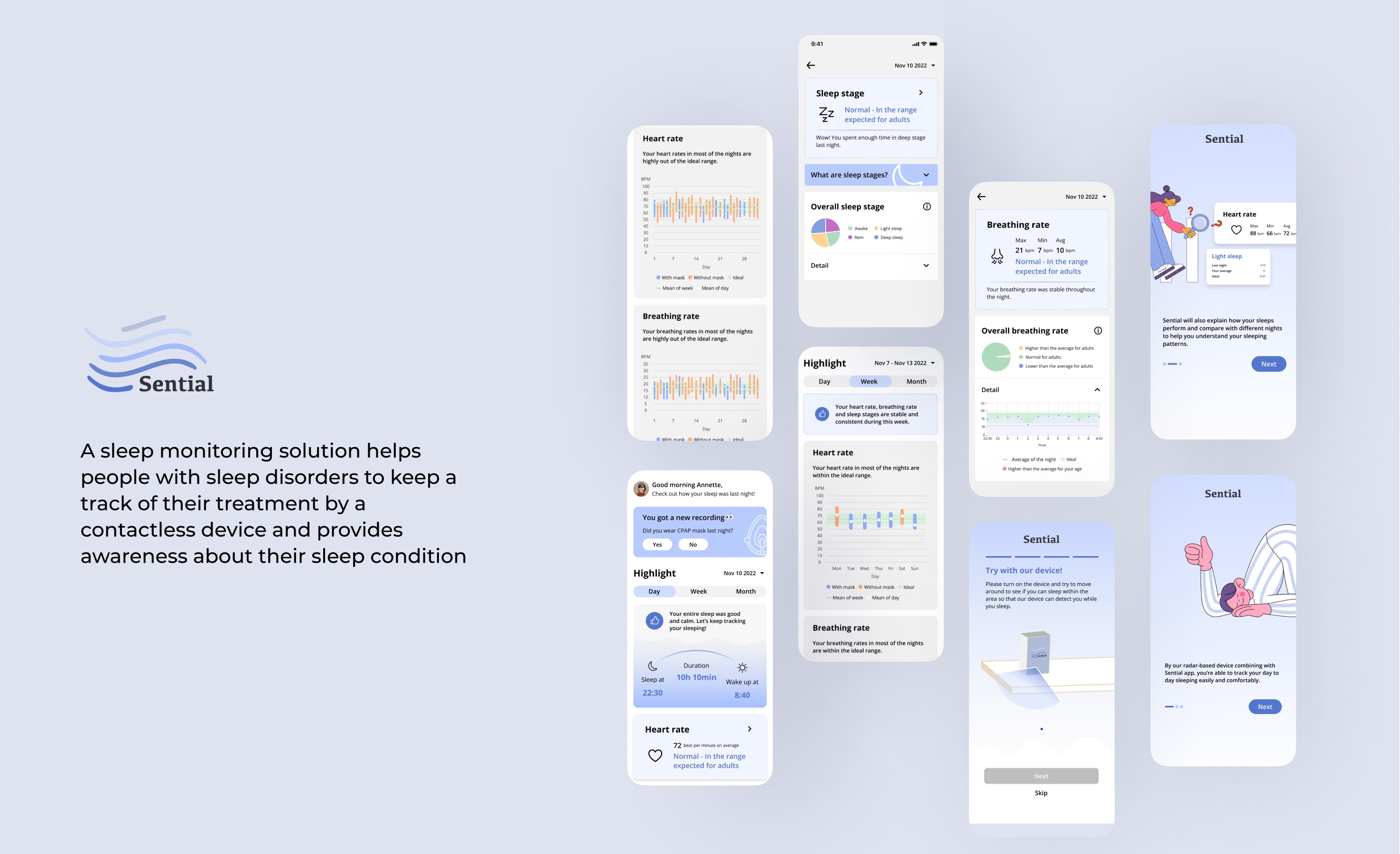
A non-invasive sleep tracking solution for those with sleep disorders, designed to provide accurate data from home. Using radar-based technology, we created a contactless solution that eliminates the discomfort and inconvenience of traditional sleep studies.
How is Sential created?
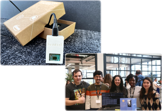
Sential was developed by a cross-functional team at DPS, Munich, including a product manager, engineers, me as the interaction designer, with Infineon providing technical support and materials as our stakeholder.
1. Wires, Clinics, and Frustrations: The Sleep Monitoring Dilemma
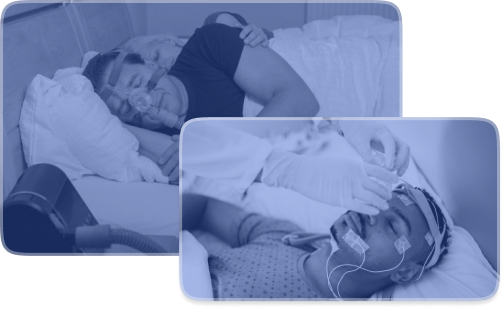
The Struggles of Traditional Sleep Assessments
- Millions with sleep disorders face the hassle of clinic visits, uncomfortable wires, and overnight stays—making sleep studies more of a burden than a solution.
Reimagining Sleep Monitoring: A Comfortable, Contactless Alternative
- We aimed to eliminate these frustrations by creating a radar-based, contactless solution that empowers users to take control of their sleep health from the comfort of home.
2. Missteps and Realizations: When Doctors Weren’t the Right Focus
- Our project started with a directive from Infineon to explore opportunities for improving sleep assessments for doctors. Initially, we targeted doctors in sleep clinics, but after my PM and I interviewed with 3 doctors in Munich, we realized their focus on clinical concerns didn’t address the real pain points of patients(fig.1). Testing this assumption early revealed that patients, not doctors, faced the bigger challenge of inconvenient and delayed assessments, with frustrations like(fig.2):

3. Redefining the Solution: Building Trust Through Convenience
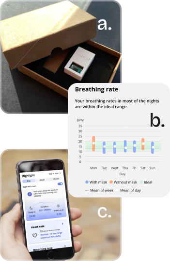
- Armed with user insights, we redefined our mission to focus on patient empowerment. Our solution leveraged radar-based technology to provide contactless vital sensing detection— we aimed to address critical user pain points:
a. Contactless monitoring of vital signs
- Eliminates wires and physical contact, solving the discomfort of traditional sleep studies.
b. Sleep pattern awareness and treatment control
- Provides real-time insights to empower informed decisions about treatment.
c. Mobile app integration
- Allows users to track, monitor, and improve sleep health from home.
4. Testing and Evolving: Uncovering What Users Truly Needed
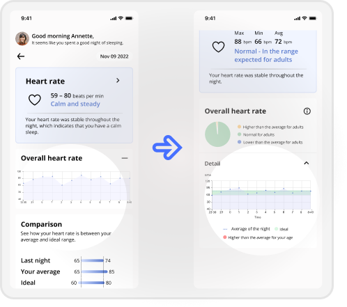
- With mid- to high-fidelity prototypes in hand, I conducted usability testing with 8 users. Their feedback shed light on critical improvements:
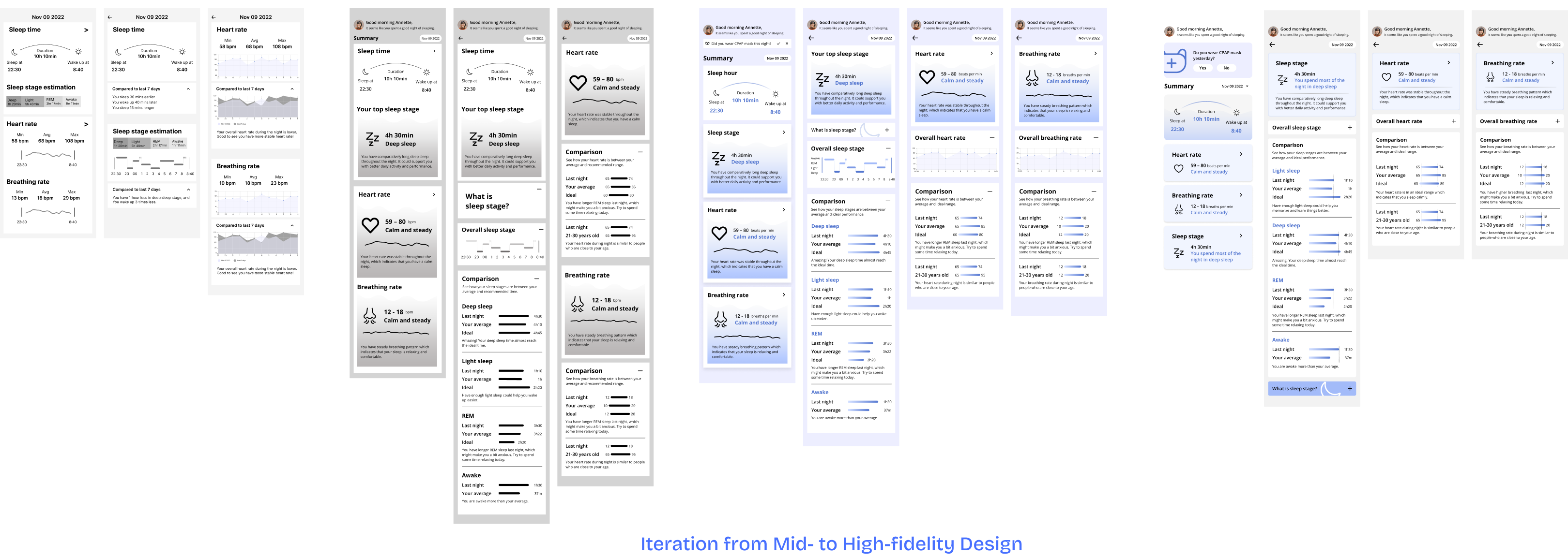
a. Comprehensive Sleep Overview
- Providing users with a holistic view of their sleep quality rather than individual metrics in isolation
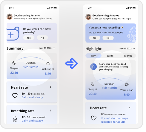
b. Visual Sleep Performance Summary
- Simplified pie chart visualization enables quick interpretation of vital signs without manual comparison
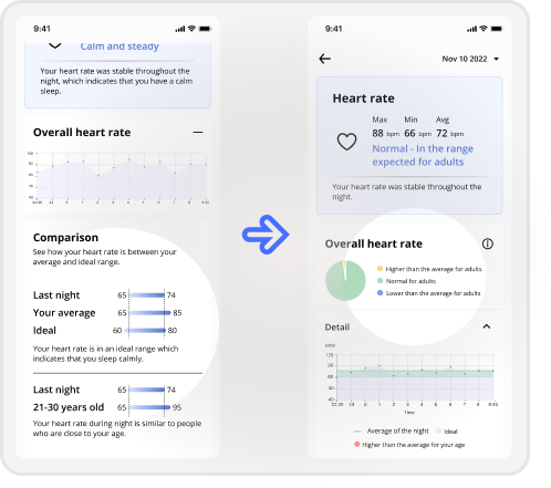
c. Self-Explanatory Data Visualization
- Integrated legends and clear labeling make vital sign charts instantly readable
5. What’s Missing? Addressing Untapped Opportunities
- As we refined the product, new opportunities emerged to enhance the experience further:
a. Automatic Detection
- We envisioned a future where users wouldn’t need to manually activate the device, ensuring a seamless setup.
b. Gamification for Retention
- By introducing fun facts, sleep challenges, and unlockable features like personalized reports, we could make the experience engaging and encourage consistent use.
6.Breaking and Rebuilding: My Key Takeaways through Sential
Dig Deeper into User Pain Points
- Instead of asking users what they want, focus on their experiences. The underlying pain often reveals the real opportunities for innovation.
Start with Assumptions, but Validate Ruthlessly
- Initial ideas are just starting points. Testing and validation ensure the final product solves the right problems.
Embrace Change to Unlock Creativity
- Sometimes the best solutions come from breaking apart existing designs and rebuilding them with fresh perspectives.
