Koffy is an international coffee store chain with locations in New York, Chicago, Tokyo, London, Nantes, Reykjavik, and more. It aims to serve quality coffee with local flair. The shops are minimalist, clean-lined. Also, they offer ready-to-drink and whole or ground beans by the pound, and pastry.
Ordering from a coffee shop could sometimes be challenging for customers when it comes to time of waiting. Customers who order for takeaway might have limited time for waiting.
Finding seats in some popular coffee shops is not an easy task. Some customers will just leave to look for another shop which has enough seats, while the others will wait for an uncertain time just to have seats so that they can dine in.
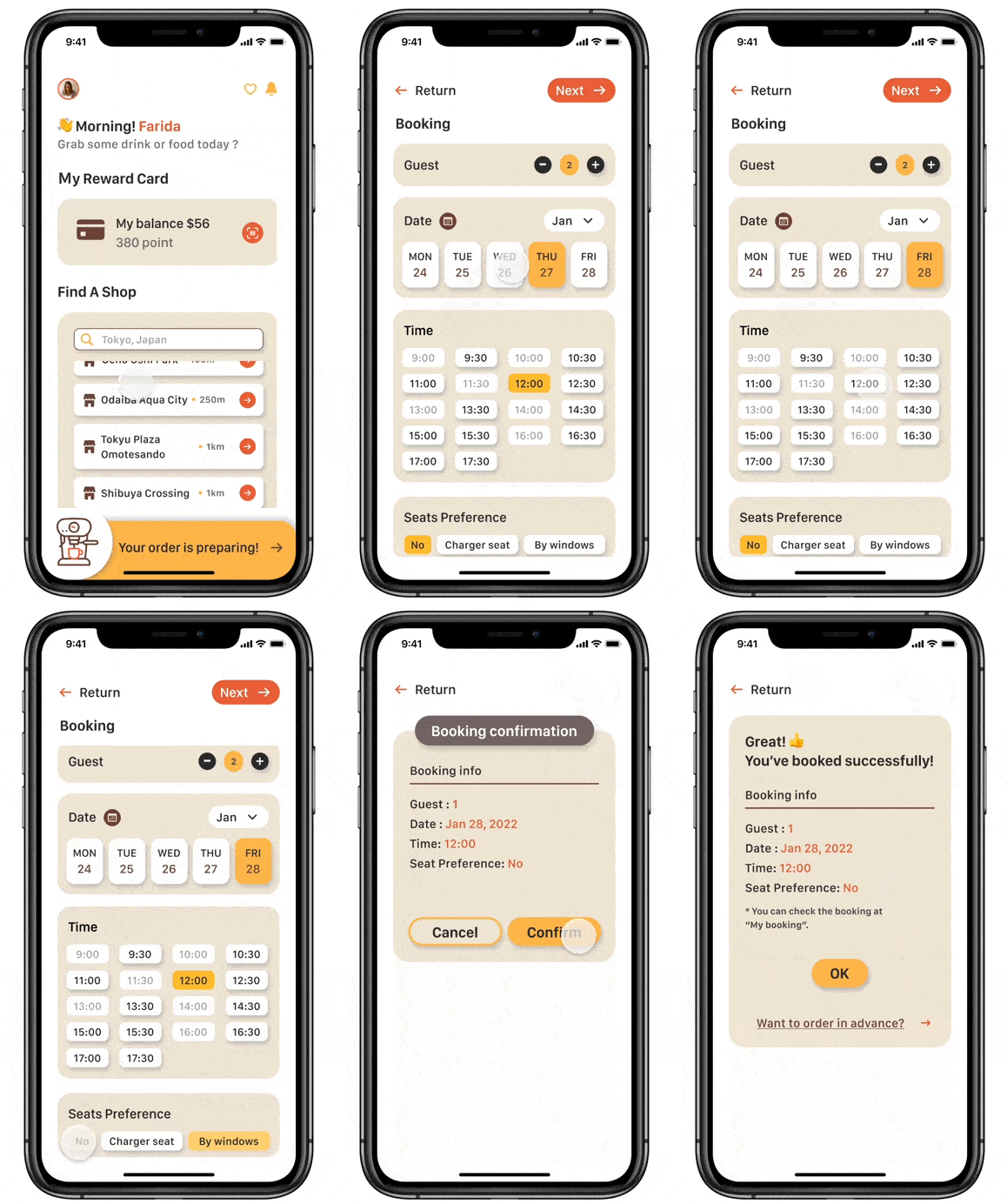
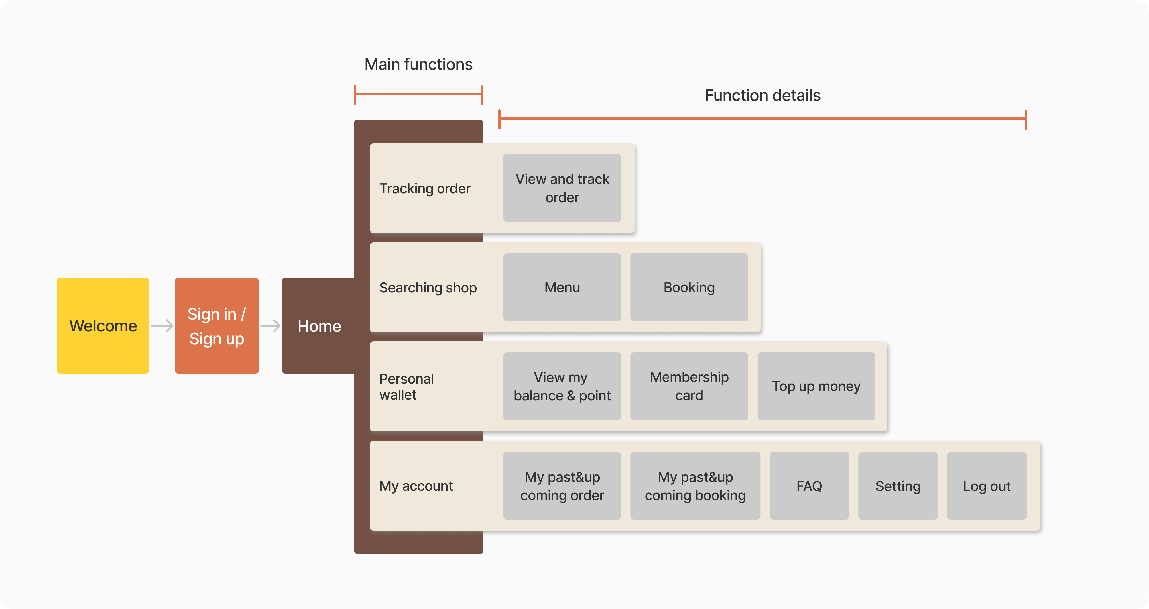
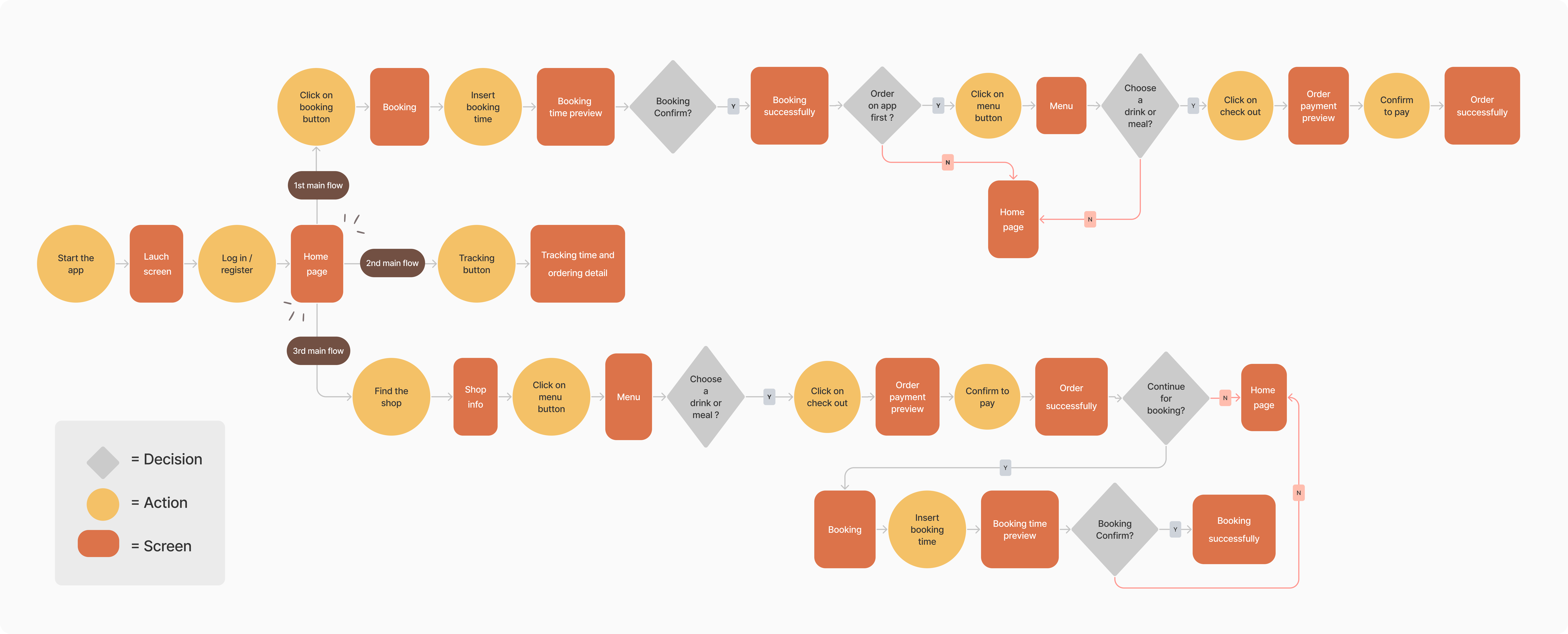
📅 Booking
Customers can book their favorite days beforehand so that they can make sure they have seats to enjoy time in Koffy.
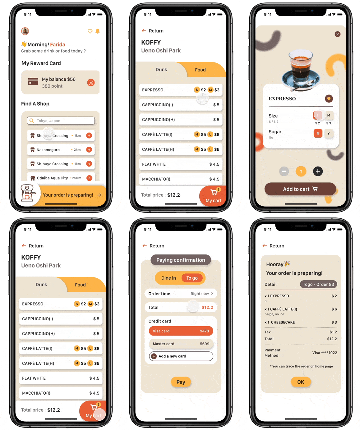
☕ Ordering
By ordering in advance, customers could take their time to pick up coffee and reduce waiting time.
🕙 Tracking
Knowing the preparing process of order, customers could not only save time waiting, but also pick up the order at the right moment.
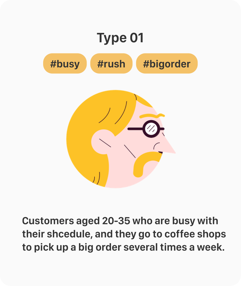
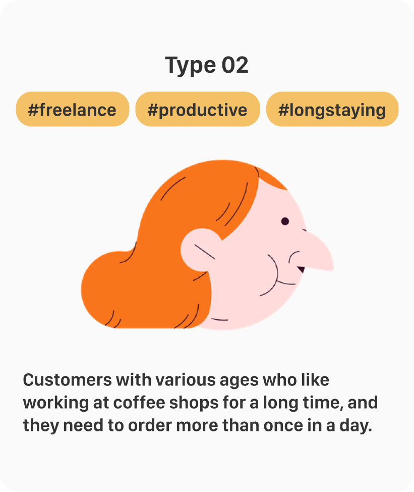
Business aspect
- Coffeeshop can reduce time on ordering and prepare orders more efficiently
- Increase the satisfaction of customers
- Develop the long-term relationship with customers
Customers aspect
- Order drinks and meals in advance and track the order anytime
- Save time on waiting no matter for orders or seats

Some shops don't have app, some provide various information from promotion, menu to ordering tutorial on app, however, ordering and reservating aren't well designed.
To find out what target users might need and problems they have while ordering and having seats in the coffee shop, I have asked following questions to 82 people aged 22-30 years old, who are having similar patterns and behavior as our target users.
01 Even waiting for lining up is normal to people, still, a group of respondents feel impatient
02 Respondents would like to order on their own app instead of ordering at the counter
01 App supports both ordering and booking
02 Simple and function-oriented for users
03 History management for ordering and booking
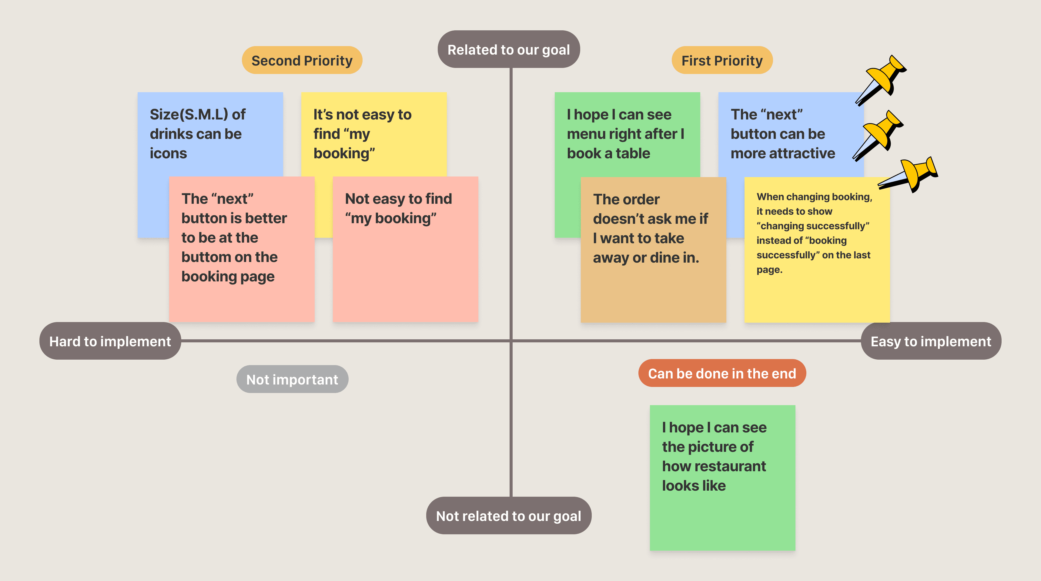
which one should we concern about first?
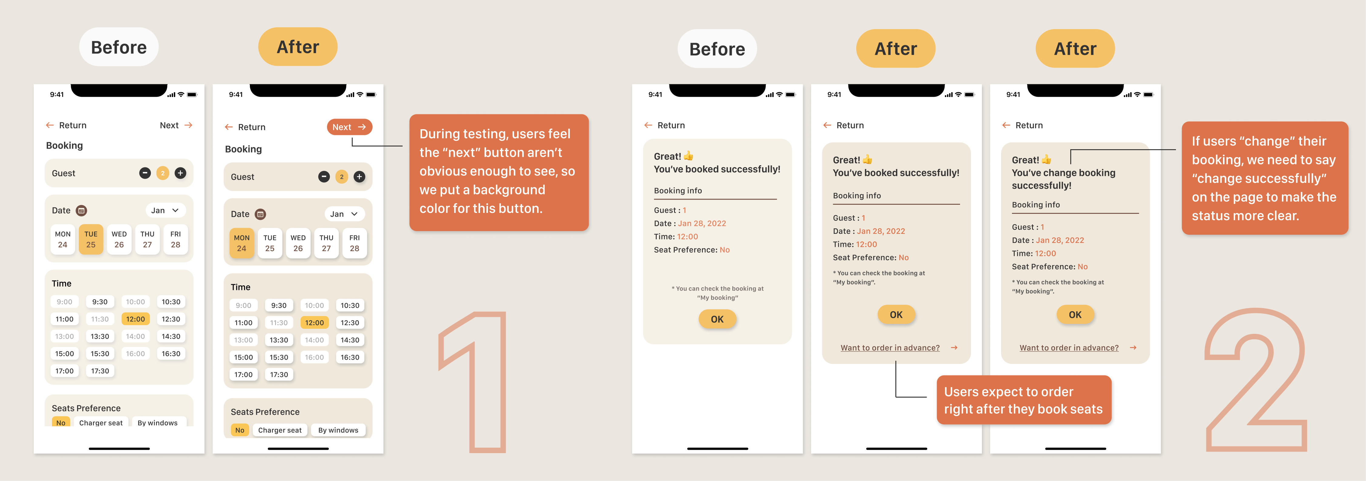
By doing so, it helps us find out our priorities which we can start with, and keep the rest in mind
From the beginning of empathizing to the end of prototyping, I realized all the process matters and one is connected to the other. There's always a WHY beyond a process I had been doing, and I had to keep reminding myself of why I should conduct this and that, otherwise, I might just like complete the tasks without any purpose.
During the whole process, it's important to remember what our goals and problems are all the time and avoid deviating by minor details.
Since this is my solo project, there's no team to review with me all the time. It's difficult to think from all the perspectives. However, this challenge did remind me not to fall into one angle when seeing or considering things.


